An image can move from a gallery wall to a book without changing its composition. The words beside it can remain identical. Yet the reader no longer meets those words under the same conditions. A label beside a print, a paragraph on the facing page and a note several pages later offer different opportunities to look, read and return.
This matters when an exhibition becomes a photobook. Copying the wall text into the book may preserve what the artist wanted to say while changing how that statement acts. Before deciding whether the words still fit, I would ask a more practical question: what can the reader keep in view while reading them?
In the preceding essay, The Reader’s Right to Disagree, I considered how an image can support a reading that differs from the intention behind it. Here I return to the same generated square. The question has shifted from which interpretation is defensible to how the arrangement of image and text makes an interpretation available for examination.
A sentence that changes what we look for
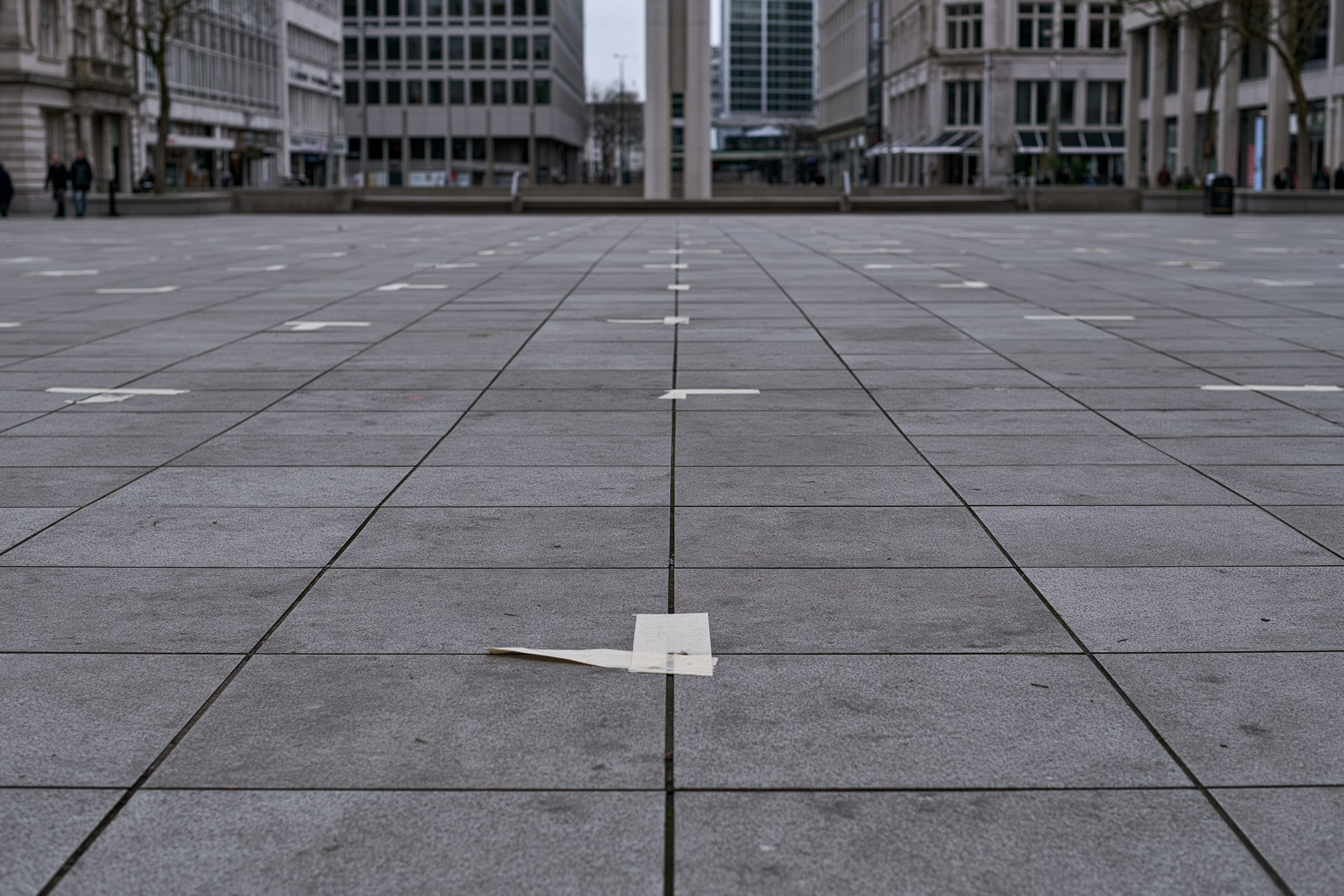
The square is organised by two kinds of line. Dark joints divide the paving into a continuous grid. White strips interrupt that grid at intervals, apparently marking individual positions. Near the bottom, one strip lifts away from the ground. Further back, the marks become smaller and less distinct, while a few figures remain at the edges of the open space.
The lifted strip can suggest removal. The regularity of the other marks can suggest preparation. Neither feature establishes what happened. In a generated image, even a convincing trace is not evidence that the event it suggests occurred.
For a placement exercise, I would use this short interpretive sentence:
The marks suggest places to be occupied, while the lifted strip suggests something being taken away.
This is newly written example text, not a quotation from an exhibition label. It directs attention towards a tension already visible in the image without naming an event. The separate identification of the image as AI-generated would remain attached to it in every version.
Placed prominently before the image, the sentence offers a task: find these two indications. Encountered afterwards, it offers a possible revision of an initial reading. Beside the image, it can be checked almost word by word against the surface. These are possibilities created by placement, rather than predictions about how every reader will behave.
What the wall allows
Imagine the image as a print with the sentence on a label to its right. This is a proposed arrangement, not an installation I have tested. If both are legible from a comfortable position, a visitor can move between the lifted strip and the phrase “taken away” without losing sight of either. The sentence becomes an invitation to compare an interpretation with a visible detail.
Now put that sentence on an introductory panel at the entrance to the room. Its reach changes. It may frame several images before the visitor has examined any of them. Returning to check its exact wording requires a different movement. A sentence written for one image can begin to sound like a claim about the whole exhibition simply because it stands at the entrance.
There is also a competing demand within the first arrangement. A large print may reward stepping back, while a small label requires coming closer. Merely placing them beside each other does not ensure that they can be read together. The relevant distance is partly between objects and partly between the positions from which those objects become legible.
I would therefore hesitate to describe a wall label as supplementary in any simple sense. Its wording may be brief, but its location can give it considerable authority over the encounter.
What the page changes
A book permits another arrangement: the square on the right-hand page and the sentence on the left. Image and words occupy a single spread. Their relationship is portable, and the reader can return to that spread without reconstructing a route through a room. The binding, margins and image size nevertheless place limits on what can be inspected together.
Move the sentence to the following page and a different problem appears. With an ordinary bound book, turning to read it removes the full image from view. The reader may remember the lifted strip, turn back to check it or continue without checking. The arrangement creates a small separation between seeing and explanation. It does not guarantee a deeper or more independent response.
This is where a useful distinction emerges. Delaying an interpretation can leave time for an initial encounter; delaying information needed to understand what kind of image this is can create a misleading one. I would not postpone the AI-generated identification until the end of the book merely to preserve a documentary impression on the opening pages. The origin of the image and a proposed reading of its marks have different responsibilities.
Gérard Genette describes the titles, names, prefaces and other materials that present a literary work as its paratext: a threshold through which the work reaches its reader (Genette, 1997). His account concerns literary texts. I borrow the question of presentation here to examine a visual work, rather than treating his argument as experimental evidence about galleries. It helps make a small editorial decision consequential: material surrounding a work participates in how the work is encountered.
Explanation can give access
There is a danger in making delayed explanation sound inherently more generous. A reader who lacks relevant knowledge may need help at the beginning. Leaving that reader alone with an image can preserve the artist’s preferred appearance of openness while offering very little access to the work.
Serena Castellotti and colleagues studied essential and descriptive labels with 30 university students in a modern art museum. Descriptive labels were associated with longer viewing and changes in visual exploration; appreciation, interest and curiosity about other works did not change significantly (Castellotti et al., 2023). The protocol involved selected paintings and guided encounters, including labels presented before viewing. It was not a comparison between exhibition walls and photobooks. I take it as evidence that explanation can alter attention, without assuming that more looking means better understanding or greater liking.
That distinction matters for the square. The example sentence may help someone notice that the white marks do not simply repeat the paving grid. It may also make the lifted strip disproportionately important. The question for an editor is whether this emphasis serves the work, and what else becomes harder to notice because of it.
A factual caption could be quite brief while an interpretive paragraph remains optional. A book might offer the paragraph after the sequence, with a clear page reference back to the image. A gallery might place a concise identification beside the print and a longer account where it can be read comfortably. Neither arrangement excuses tiny type or an obscure route to information. Making an interpretation optional should not make essential context inaccessible.
A comparison worth making before printing
For this image, I would prepare three inexpensive versions before committing to a book layout. The exercise isolates where the sentence appears; it is not a simulation of the full bodily experience of an exhibition.
| Version | Image and text arrangement | What to inspect |
|---|---|---|
| Beside | Image and sentence visible together; in a wall mock-up, use a proposed viewing distance. | Can the detail and the exact wording be checked without awkward repositioning? |
| Facing | Image on one page, sentence on the facing page. | Does the text help inspect the image, or dominate the spread through its position and size? |
| Following | Image first, sentence after a page turn. | What must be remembered, and what makes it worth turning back? |
I would keep the image, sentence and origin information unchanged, then inspect each arrangement at its intended physical size. A screen view cannot settle whether the foreground strip will remain legible in a small print. Nor should a wall mock-up inherit the dimensions of a book simply to make the comparison look controlled.
A second reader could be asked which detail they noticed first, what the sentence changed and whether they wanted to return to the image. Those answers would be useful observations about these particular versions, not proof of a universal rule. If the first version always comes first, familiarity could affect the later responses. Even a modest comparison needs that reservation.
The purpose would be to identify a decision I can actually revise. If the sentence merely repeats what readers already notice, it may be unnecessary. If it enables them to examine a tension that otherwise remains obscure, it may earn its place. If they accept it while finding little support in the image, I should reconsider the sentence as well as its position.
Carrying a work into another form
A wall and a page each allow return, interruption and comparison, but they organise those possibilities differently. I would not claim that the gallery gives freedom while the book imposes a sequence. A visitor can follow a prescribed route; a reader can open a book in the middle. The maker arranges conditions without possessing the encounter.
For the square, my provisional choice would be to keep its origin clear and allow the interpretive sentence to be checked against the image on the same spread. The lifted strip is small enough that asking a reader to remember it across a page turn may add effort without adding much to this particular argument. A different sequence could justify the delay. That decision would need to emerge from the sequence, rather than from a general preference for less explanation.
When a work moves from the wall to the page, its accompanying words deserve another edit. I would begin by checking what the reader can see while reading, what must be recalled and what can readily be revisited. Only then would I decide whether the original sentence still does the work I need it to do.
References
Castellotti, S., D’Agostino, O., Mencarini, A., Fabozzi, M., Varano, R., Mastandrea, S., Baldriga, I., & Del Viva, M. M. (2023). Psychophysiological and behavioral responses to descriptive labels in modern art museums. PLOS ONE, 18(5), e0284149. https://doi.org/10.1371/journal.pone.0284149
Genette, G. (1997). Introduction. In Paratexts: Thresholds of Interpretation (J. E. Lewin, Trans., pp. 1–15). Cambridge University Press. https://doi.org/10.1017/CBO9780511549373.003
Continue reading
The Reader’s Right to Disagree considers how the same square can support competing interpretations, and how to distinguish visible evidence from a suggested story.